Sometimes it is useful to visualize data from a logic analyzer in a graphical way but unfortunately not many applications can do that so I came up with a solution involving CSV data and LibreOffice Calc. Here I am using Logic from Saleae but any software that can export the data to a CSV file can work.
Usage
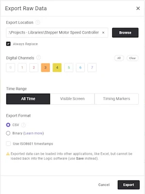
First thing to do is to export the data from the logic analyzer software to a CSV file format. In Logic 2 this can be easily achieved by going to File -> Export Data or by pressing CTRL + SHIFT + S.
Before pressing Export, select a folder where the "digital.csv" file
will be saved. Then select the channels that you want to be included by first
clicking on Clear to exclude all. The included LibreOffice file has support
for 2 channels. If you need more than this leave it in the comments and I will
try to modify the file.
It is helpful to give each channel a name so you know what data belongs to which channel in the LibreOffice Calc file.
Next place this file
plot CSV data.ods
in the same folder where the CSV file was saved. Note: the file can't be
previewed in Google Drive because it is of a LibreOffice Calc format not
Excel.
After opening the file you need to click on "Allow updating". This is because on every 10 seconds the ODS file will import the data from the CSV file so if you export new data from the logic analyzer the file will be updated. The refresh time can be set to any value but it can not be changed afterwards unless you repeat the importing data process. For me 10 seconds works just fine.
The imported data can be found in the Data tab of the ODS file. First column holds the timestamp for each transition - a 1 represents a rising edge and 0 a falling edge.
Now that we have the data imported we need to measure the time between each rising edge but first the data needs to be filtered by excluding negative time values and removing rows that have the 0 value. This is done using Pivot Tables. At the moment LibreOffice doesn't update the table automatically so every time the data has changed the table must be updated manually by right-clicking and selecting Refresh.

|
|
click to enlarge |
Finally, in the Plot tab you can see the plotted data. Since the number of rising edge transitions can vary each time, don't forget to use Data -> Refresh Range so all rows can fit in the graph.
In the provided file I have plotted stepper motor RPM versus step number but it can be adapted to other purposes.


No comments:
Post a Comment